Woodfarm Education Centre
Designing a website for a thriving community
Designing a website for a thriving community
A website project as part of a community initiative. The project covered the UX and UI of a community website from discovery through to development.
I designed a website for a community centre based in Glasgow, Scotland. The project focused on the needs of the community surrounding the centre. This resulted in a hub that encouraged citizens and families to visit and take part in engaging activites.
Tools Used

Figma

Framer

Adobe Illustrator

Miro
Miro
Sector
Community
Community
Area of focus
UX/UI Design
Website Design
UX/UI Design
Website Design
Timeline
2024 - 2025
2024 - 2025
2024 - 2025
Skills
Wireframing
Wireframing
Wireframing
Interactive Prototyping
Interactive Prototyping
Interactive Prototyping
Iconography
Iconography
Iconography
Typography
Typography
Typography
layout
layout
layout
Branding
Branding
Branding
Hierarchy
Hierarchy
Hierarchy
User Flows
User Flows
User Flows
The Problem & Context
The Problem & Context
The community centre chairman and board required a website redesign that would engage the community they were apart of not just physically but digitally. The project addressed low user engagement and poor accessibility, which limited community participation and reduced the platform’s overall impact. This was significant as it affected user retention, trust, and the organisation’s ability to effectively share information and services with its diverse audience.
The community centre chairman and board required a website redesign that would engage the community they were apart of not just physically but digitally. The project addressed low user engagement and poor accessibility, which limited community participation and reduced the platform’s overall impact. This was significant as it affected user retention, trust, and the organisation’s ability to effectively share information and services with its diverse audience.
The Design Process
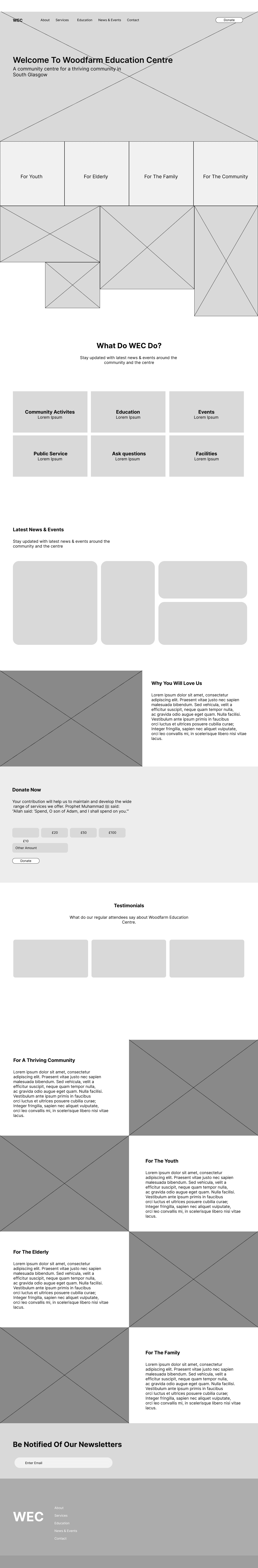
Wireframes
I began by creating low-fidelity wireframes to map user flows, structure content, and prioritise usability. This stage focused on layout hierarchy, navigation clarity, and accessibility considerations. Iterating quickly in Figma, I tested ideas and refined key journeys, ensuring the foundation addressed user needs before moving into more detailed visual design stages.
High Fidelity Prototype
I developed high-fidelity prototypes in Figma, applying branding, typography, colour systems, and interactive components. This stage brought the interface to life, allowing realistic user testing and feedback. I focused on consistency, accessibility, and micro-interactions, ensuring the design was both visually engaging and functional before transitioning into development-ready assets and specifications.

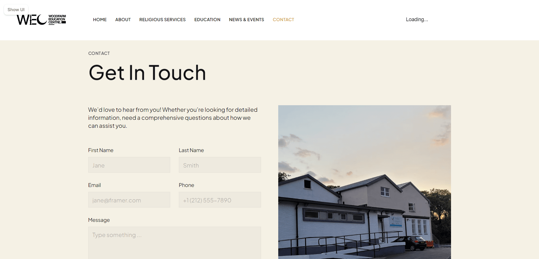
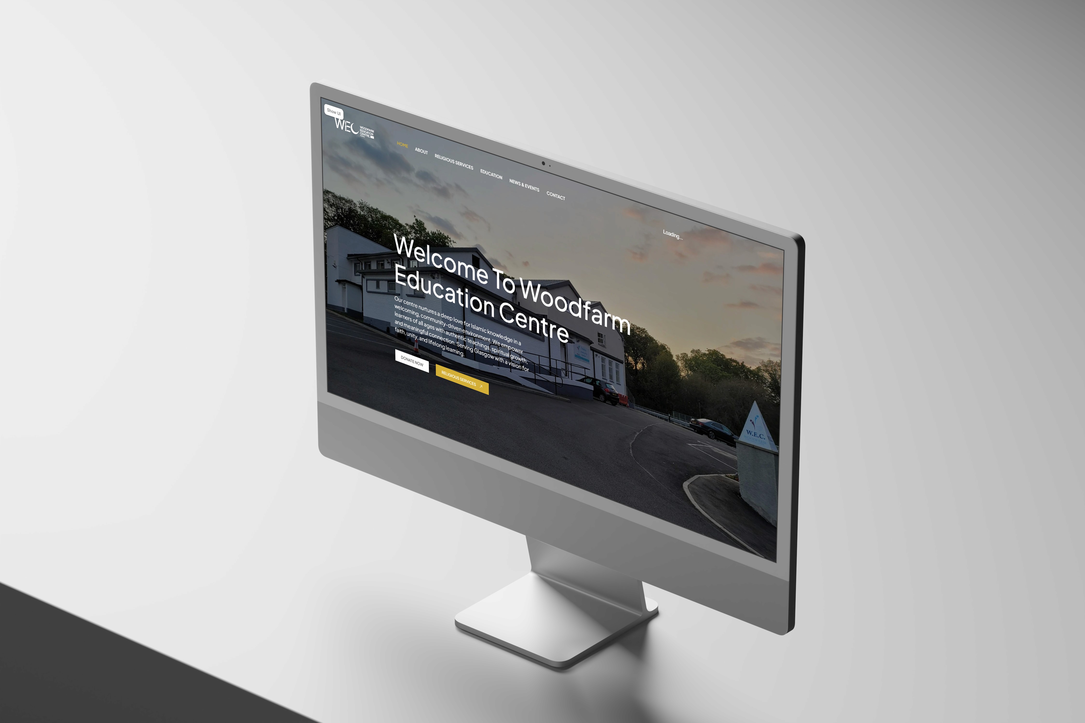
Transition to Framer
I translated the approved designs into Framer, focusing on responsiveness and smooth interactions. This stage involved recreating layouts, adding animations, and ensuring performance across devices. I refined user flows within a live environment, bridging the gap between static design and functional product while maintaining visual consistency and usability standards established earlier.

Using Framer for development
Using Stackflow, I structured navigation and built a seamless flow between pages, simulating app-like transitions within the website. This allowed for efficient state management and improved user experience. I ensured smooth routing, intuitive interactions, and consistency across pages, creating a cohesive and responsive final product aligned with the original design goals.


Reflections
This project strengthened my end-to-end UX/UI process, from research through to prototyping and implementation. I improved my ability to design with accessibility and diverse users in mind, while also becoming more confident using tools like Figma, Framer, and Stackflow together. Working within a voluntary context required adaptability, prioritisation, and clear decision-making without formal constraints.
Haaris Ahmed
Copyright 2026 by Haaris Ahmed
Haaris Ahmed
Copyright 2026 by Haaris Ahmed
Haaris Ahmed
Copyright 2026 by Haaris Ahmed
The Design Process
Wireframes
I began by creating low-fidelity wireframes to map user flows, structure content, and prioritise usability. This stage focused on layout hierarchy, navigation clarity, and accessibility considerations. Iterating quickly in Figma, I tested ideas and refined key journeys, ensuring the foundation addressed user needs before moving into more detailed visual design stages.
High Fidelity Prototype
I developed high-fidelity prototypes in Figma, applying branding, typography, colour systems, and interactive components. This stage brought the interface to life, allowing realistic user testing and feedback. I focused on consistency, accessibility, and micro-interactions, ensuring the design was both visually engaging and functional before transitioning into development-ready assets and specifications.
Transition to Framer
I translated the approved designs into Framer, focusing on responsiveness and smooth interactions. This stage involved recreating layouts, adding animations, and ensuring performance across devices. I refined user flows within a live environment, bridging the gap between static design and functional product while maintaining visual consistency and usability standards established earlier.
Using Framer for development
Using Stackflow, I structured navigation and built a seamless flow between pages, simulating app-like transitions within the website. This allowed for efficient state management and improved user experience. I ensured smooth routing, intuitive interactions, and consistency across pages, creating a cohesive and responsive final product aligned with the original design goals.